 |
| (Fully aware it looks like a poster) |
Wednesday 24 June 2015
Wednesday 11 February 2015

Wednesday 17 December 2014
Audience & Demographics | Media Coursework
E4 is the self-proclaimed “destination” for a cutting edge
young audience. E4 are currently on Freeview, DSAT, and cable this means that
the content I produce should be seen by all these different types of viewers
but should still be contained in the age bracket of 15-35 as if I do not stick
to this it means that I would not be sticking to the brief as my content should
be aimed towards the E4’s demographic.
E4 and there sibling channel E4+1 are able to reach over 8.9
million viewers per each month but 52% of the viewers are aged between 16-34
which means the majority of the audience of E4 is mainly consisted of 16-34
year olds. This means that I should ideally be aiming my content that I produce
to this age bracket.
The majority of TV programmes that E4 currently broadcasts
is mainly comedy:

As you can see from this current TV schedule (taken from 17/12/14)
it shows that most of the shows that E4 are currently broadcasting is mainly
either comedy or drama. E4 will often show a late movie which is usually
broadcasted after 9pm. This is because after 9pm shows are allowed to have
swearing or violence in so that’s why E4 mainly shows a movie after the 9pm
pre-watershed time frame.
With this information it means that I should ideally create
an original TV programme which is either classed as a comedy or classed as a drama.
This way I would be able to gain as many viewers from my target audience as
possible as they are used to watching these sorts of programmes.
However because Silver Lining Productions is known for pushing
the boundaries it means that I am able to create content which may be original
and unique to E4. Because Silver Lining Productions is known for their recent
success with fly on the wall documentaries it means that I am open to create an
original documentary based around something I want to film. The idea of a
quasi-documentary really appeals to me as it would mean I would be able to follow
certain conventions of a normal documentary but yet still make is original and
appealing enough so that it would appeal to the people who are aged between 15-35 years.
The idea of a quasi-documentary means that the content I would be producing
content that would follow the conventions of a normal documentary but at the
same time the content would not intentionally be classed as a documentary.
I feel like this sort of genre of content would be unique as
you do not see that many quasi-documentaries which are broadcasted currently in
this day and age, so creating this type of content would mean I would be
creating something which the audience would not frequently view so this may be
an advantage as it may intrigue them due to the fact of it being considered
almost as the “unknown” and they would want to know more about what this new
genre of TV programme is and what the potential of it could be.
The top 10 shows that E4 have in terms of views are:
Misfits
Skins (UK)
Come Dine With Me
The Inbetweeners
Dead Set
Made In Chelsea
Fonejacker
Sorority Girls
Nearly Famous
Beaver Falls
Therefore if I were to create a quasi-documentary it allows
the audience and the viewers to witness some new content instead of me just
creating another comedy programme.
Final Logo | Media Research
For the brief I chose, Silver Lining Productions, I had to
create a logo which would be noticed by people which meant I had to make it
memorable. My aim for the design of the logo was to make it simple but yet at
the same time effective enough so that people were able to link my logo with
the well-known company.
I therefore decided to create this as my final logo:

I chose to make my logo look like this because it corresponds
to how I wanted my logo to look “simple” and “effective”. The use of only two
colours throughout the logo clearly portrays the simplicity of the logo and at
the same time people are able to recognise what the logo says instead of being
distracted by a barrage of colours. I chose to use white text on a black background
as I feel it not only looks more aesthetically pleasing but it is also more
effective than a white background with black text. As you can see…

The font I used for my final logo was a font which is not a well-known
font, “Diner Regular” is not a common font which is used by people and so I decided
to use this as it gives a sense of professionalism to people who view it. I decided
to place a rectangular border around it as I wanted my logo to look modern but
yet traditional at the same time. By keeping the border the same colour, white,
as my font colour it meant that the audience would not be put off with a
mixture of colours on the frame at the same time. If there were a load of
colour on the screen at once then the audience would not be drawn into the
centre of the frame where the font actually is, I also chose to align
everything so that it is central, this means that the audiences eyes are automatically
drawn to the centre of any image, it’s just the way that humans operate, so by
centrally aligning everything in the frame it means that the audience will automatically
look directly at the centre of the image.
The two colours were chosen carefully as I wanted to
represent the idea of “silver” as I am doing the Silver Lining Production brief.
When people hear the word “silver” they often refer it to a traditional saying
which goes like “Every cloud has a silver lining” so instead of typically
creating my final logo based on the words in clouds I decided to take a
different approach. The approach I decided to take is based around the two
colours that on the frame. By mixing the colour black and white it will give
you a grey colour which is linked and associated with the mono chromic colour
tone, and because the colour silver is also a part of the mono chromic colour
scale it means that instead of choosing a bright colour such as a light blue or
red, I decided to stick with black and white because when mixed it will give
you a mono chromic colour which is linked to the word “silver” in Silver Lining
Productions. Another reason why I chose to stick with a black and white theme
is because it demonstrates tradition. Because there was no colour back in the
older centuries it portrays how Silver Lining Productions has been in the
broadcasting since the older years and it highlights the idea of instead of
being some new channel that people are unaware about, the black and white
colour scheme makes the audience believe that Silver Lining Productions has
been broadcasting for a really long time. So the black and white colours used
conveys the images and ideas of people trusting this company.
Overall the logo looks professional and effective at the
same time and with the addition of the rectangular border it conceals the whole
logo making it simple and effective.

This is now my final design for my Silver Lining Productions
logo:
I decided to animate my logo as I didn’t want it to remain stationary
when I included it in the opening titles of my TV programme. I didn’t want it
to remain stationary as I thought it would look too plain but by animating it,
it adds a whole new depth to the logo and allows the viewers’ attention to be
really drawn in by the logo. The animation itself is quite simple and is
composed up of an only a few individual elements. I didn’t want to create an
animation that took up the whole stage and include a barrage of different
motions and animated movements so instead I stuck to my goal of creating a
simple and effective logo. With the lines of the rectangular border coming
together in the centre of the screen it demonstrates an idea of unity, just how
the individual strands come together to form the border Silver Linings is all
about creating original content that can be watched by all and shared by all
therefore creating a sense of community when everyone comes together to talk
about the content.
Logo Designs | Media Research (UNFINISHED)
I wanted my final logo to look simple but yet effective so I
decided not to overload my logo with a lot of content, this can be seen in all
of the prototypes of logos.
The design for my first logo was something that I quickly
pieced together to see what a rough sketch/idea would look like. I used the
idea of the well-known phrase “every cloud has a silver lining” and used an
image off the internet as my background (the cloud) and then used Photoshop to
just apply text which stated the name of the company. I wasn’t really blown
away with the design of this logo as it took me very little time to create it,
although the logo did the job of saying who the company is, I thought it looked
too generic as any other Silver Lining logo.
 |
| ^^ First Logo Design ^^ |
These next two logos are still playing with the same idea of
using the phrase as the background for my logo but yet again I still didn’t think
that the logos looked quite effective, they were simple to design and create
but I don’t think they filled their purpose well enough. I went for two
different variations of font colour for these logos as I thought the font
colour of this following logo clashed too much against the colours and
smoothness of the clouds in the background.
 |
| ^^ Second Logo Design ^^ |
I thought the colour of
the text was too dark and therefore did not complement the light colours used
for the clouds and the background colours. So with this in mind I decided to
change the colour of the text so that it would not clash against the light
colours used. I therefore sample picked one of the colours in the clouds, the
following image shows the results of this change.
 |
| ^^ Third Logo Design ^^ |
I feel that this logo is much better than the alternate one
with the black text. I feel that the grey colour used goes really well with the
blue sky and the clouds. However I did not choose this logo as my final design
as I thought there was too much going on in the frame at the same time for the
viewer to focus on one specific element.
 |
| ^^ Fourth Logo Design ^^ |
 |
| ^^ Fifth Logo Design ^^ |
 |
| ^^ Sixth Logo Design ^^ |
 |
| ^^ Seventh Logo Design ^^ |
|
| ^^ Eighth Logo Design ^^ |
 |
| ^^ Ninth Logo Design ^^ |
|
| ^^ Tenth Logo Design ^^ |
Logo Research | Media Coursework
For my media AS coursework I have decided to choose the
Silver Linings Production brief. Because the brief I have chosen is based
around creating television products I will be therefore be looking at what
elements make up a good and effective television logo but yet still at the same
time represents the company itself.
I believe that a logo must stand out from its competitors
but at the same time it must still look appealing for viewers to be drawn into
the channel. Logos are an important element that makes up a part of a
television company, the help people acknowledge the company or brand. I
personally feel that a logo should be simple and not have too much going on in
one frame. This is because you want people to quickly look at your logo and you
want them to be remembered what your logo represents and is promoting.
Modern television broadcasters aim to create simple and
memorable logos. They do this by either using a shape for the background then
adding text to the foreground, or they just simply use an acronym. Television
broadcasters often use shapes for the base of their logo because it sets their
logo out from them rest of them. Many traditional TV stations used a simple box
for their logo to fit into. A classic example of using a rectangular shape for
the base of their logo is the BBC.
| ^^ BBC Logo ^^ |
The BBC uses a rectangular shape as the background for their
logo because it is a bold shape which supports their bold font choice in the
logo itself. By using a black rectangle with white squares it is easily
recognisable to people so they can quickly reference it to the television
station. The denotations that are picked up from this logo is that the logo is
a bold and a fairly simple logo. However by using such a bold and black
background it can also be viewed to be linked with power and supremacy which
demonstrates how this logo has its connotations. By using a black and white
colour scheme for the logo it creates a sense of trust and loyalty that the BBC
can provide to its audience. Black and white was the only colours that were
shown in the past before colour films were invented. So by sticking with this
black and white theme it portrays how the BBC has progressed through the ages
and is still broadcasting television programmes so because it has been doing it
for so long then they must be trusted to bring its viewers quality
entertainment.
The font used for the BBC logo is quite a bold and solid
font. A solid font has to be used in the creation of a logo, especially for one
that’s going to be shown to millions of people via a screen, so that the
audience can clearly see what company or brand is being advertised or promoted.
If the font is a thin font then people are going to have a hard time trying to
view the text. The font itself has to be quite a large font size. If the font
size is too small then people are not going to be able to see it especially if
the background consumes most of the canvas. The colour of the text is also a
significant factor that affects the look and appeal of your logo. The BBC used
a black colour for their font colour but because they had added the white
squares on top of their black background it meant that the black text did not
blend in with the background. So it is therefore that you choose a font colour
that does not blend in with the background of the logo. Because the foreground
of the logo usually contains the text input the text must be able to stand out
against the colour(s) of the background.
Another effective technique the BBC uses to create an
effective logo is the use of an acronym. Not many people and viewers of the
television station honestly know what the word “BBC” actually means. The
majority of people do not really care about what the backstory is behind the
company name. All people want to hear is the term they associate the channel
with. When people hear the word “BBC” they associate it with a successful TV
station that is trusted by many people. So by creating an acronym for their
channel it allows people to incorporate the channels names quickly into a
sentence. For example when two friend are having a conversation and are talking
about the latest TV programmes then they will not use the full TV stations
name, they will use the acronym they have learnt to come to terms with. During
a conversation not a single person would mention a channel called The British
Broadcasting Service, they will stick to using the acronym. Therefore the use
of an acronym is an effective technique to make your channel memorable to
people and makes it for people to relate to. This clearly shows that the BBC
stuck to the principle of keeping their logo simple.
The BBC used a bold font and a simple background because
they are not a channel which only broadcasts one type of television programmes,
they broadcast a whole genre of TV programmes so making their logo dedicated to
Si-Fi programmes would not give the public a clear view of what the channel
broadcasts and how simple the channel is.
Another example of a television channel using a shape for
their background is Food Network. Food Network have taken more of a traditional
approach when it came to creating their logo. Instead of copying the BBC with a
black rectangle as the background, Food Network have taken a different route
with their logo.
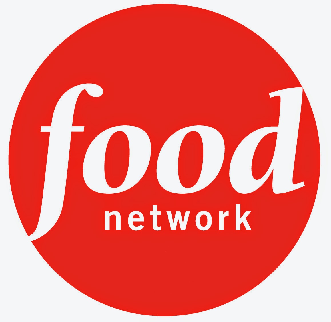 |
| ^^ Food Network Logo ^^ |
By using a circle for
the canvas of their logo, Food Network is clearly demonstrating use of
connotations as the circle can represent the channel to be more rounded in a
specific field of television programmes. This is true because this channel is
always broadcasting food related TV programmes. Therefore the connotations
behind the use of the circle as the canvas if the logo is a clear
representation of the channel.
By not using an acronym in their logo as the BBC do for
theirs, it clearly presents to people
that this channel is for “food” related television programmes and nothing else.
This channel therefore is aiming to entice people who are interested in food
either as a passion or a hobby.
By using all lower case letters in the logo it demonstrates
the channel being more passive instead of being bold and in your face like the
BBC logo. By having the word “food” in a bigger font size it reinforces the
idea of this channel being dedicated to be broadcasting food related television
programmes. The word “network” is being presented to be more passive in the
logo itself as not many people care about the channel being a part of a
network, people are mainly drawn to this channel as the first thing they see
when they view this logo is the word “food”.
By actually stating what this channel is all about and not
using a provocative acronym like the BBC did, it clearly demonstrates what the
channel is all about and who the channel is aiming towards.
Unlike the BBC logo, the Food Network logo does not stick to
a traditional black and white colour scheme. Because this is quite a young and
modern channel the use of black and white colours being a part of the channel
logo would not fit their audience and their morals. The channel itself does
broadcast olden day cookery programmes, the channel focuses more on the
traditional cookery programmes and therefore if they did use a black and white
colour scheme then they would not be abiding to what they are currently
broadcasting as black and white is associated with the traditional era whereas
Food Network aim to appeal to the modern era.
The Brief | Media Coursework
For my AS Media Coursework I have decided to choose the
first brief, Silver Lining Productions. Silver lining productions is a
multi-media production company that has had recent television success with
their broadcasts of:
- Fly on the wall documentaries
- Structered reality programmes
- And fictional products
Because Silver lining productions
have had a recent success in terms of these different genres, this has
influenced my decisions in terms of the tasks which I must complete. This means
I shall try to stick within these types of genres because if they have had a
recent success in these genres then it would make sense for me to produce
content which fits into the bracket of these successful genres. Also because
the company is known for pushing the boundaries when it comes to their content
and what they broadcast it means that I am allowed to take more of a creative
approach to these types of genres which have been listed above. The audience of
my content should be aimed towards the E4’s demographic of 15-35 year olds and
should also be suitable to be showed before 9pm, this means that it must be
pre-watershed.
The brief allows me to create
three different types of media, out of these three choices I have been given I have
decided to go with the printing and the broadcasting elements of the brief.
For the print aspect of the brief the
choice I have is to either create 3 A4 promotional teaser advertisements which
can be published before the broadcast of my content or I am able to create a
front cover and two further pages which would be used in a specialist souvenir
magazine. Out of these two options I have decided to create the teaser
advertisements as I feel I will be able to attract more of an audience and
because it allows me to sharpen my skills when it comes to creating original
content which not only looks appealing to the target audience but yet at the
same time promotes my created content in an effective manner.
For the broadcasting aspect of my
chosen brief it this time gives me three different routes which I am able to
take. The first option that I am given is to create the opening two minutes of
my TV programme. This can include a title sequence but it ultimately must last
for an approximate two minutes. The next option that I can choose if I want to
is to create viral marketing products for a new broadcast production or the
last option allows me to create a two minute clip that can be used as a feature
on a selected radio station. For the broadcasting side of the brief I have chosen
to go with creating the opening two minutes of my own TV programme as I feel as
though this would be more of a challenge for me as it would really consists of personal
creativeness and as Silver lining productions is known for pushing the
boundaries I feel as though choosing the opening two minutes of my own created
TV programme would fit right in with the company itself as I would be using
conventions found in normal TV programmes, that the company has had recent
success with, and turning these conventions so the company has original and
creative content to broadcast.
Sunday 16 November 2014


Wednesday 29 October 2014

Domestic Abuse Advert | Miss Langston
 The advert is quite shocking due to the typical commercial ideas used in it. By positioning the female model in the centre of the frame with her direct gaze to the audience it portrays how not only is she the focus of attention but how she is also silently pleading to the public for help and a way out of domestic abuse. By digitally adjusting the woman's' skin so that it is demonstrated to be flawless looking skin, the advert is trying to sell you the idea of not only by buying this foundation itself but you are also buying a perfect and flawless relationship in which domestic abuse is not a real thing.
Sunday 5 October 2014


Saturday 20 September 2014
Adverts Are Meaningless Without Text | Anchorage
 |
| ^^ ORIGINAL BURGER KING CHEESEBURGER DEAL ^^ |
 |
| ^^ SAME ADVERT MINUS THE ANCHORAGE ^^ |
^^
Thursday 18 September 2014

Sunday 7 September 2014
Subscribe to:
Posts (Atom)